LITTLE ESSENTIALS
CLIENT:
buybuyBABY
ROLE:
Art Director | Designer | Illustrator
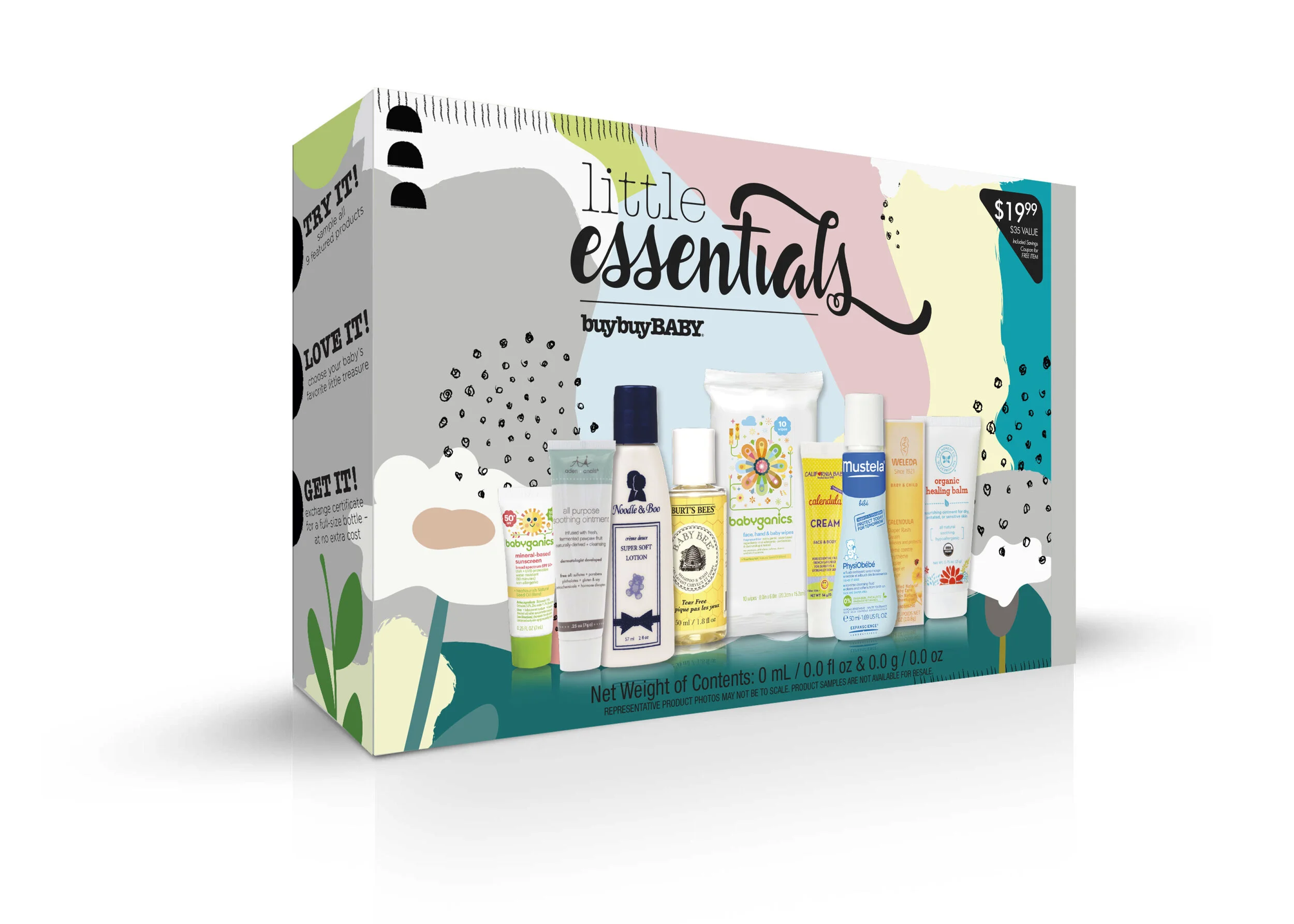
Designed with new parents in mind, the Little Essentials Kit includes samples of popular baby products, as well as coupons to redeem full-size products in-store or online.
PROJECT GOAL:
Create a brand and visual strategy for the Little Essentials Kit that attracts consumers to this new buybuyBABY exclusive.
CONCEPT 1
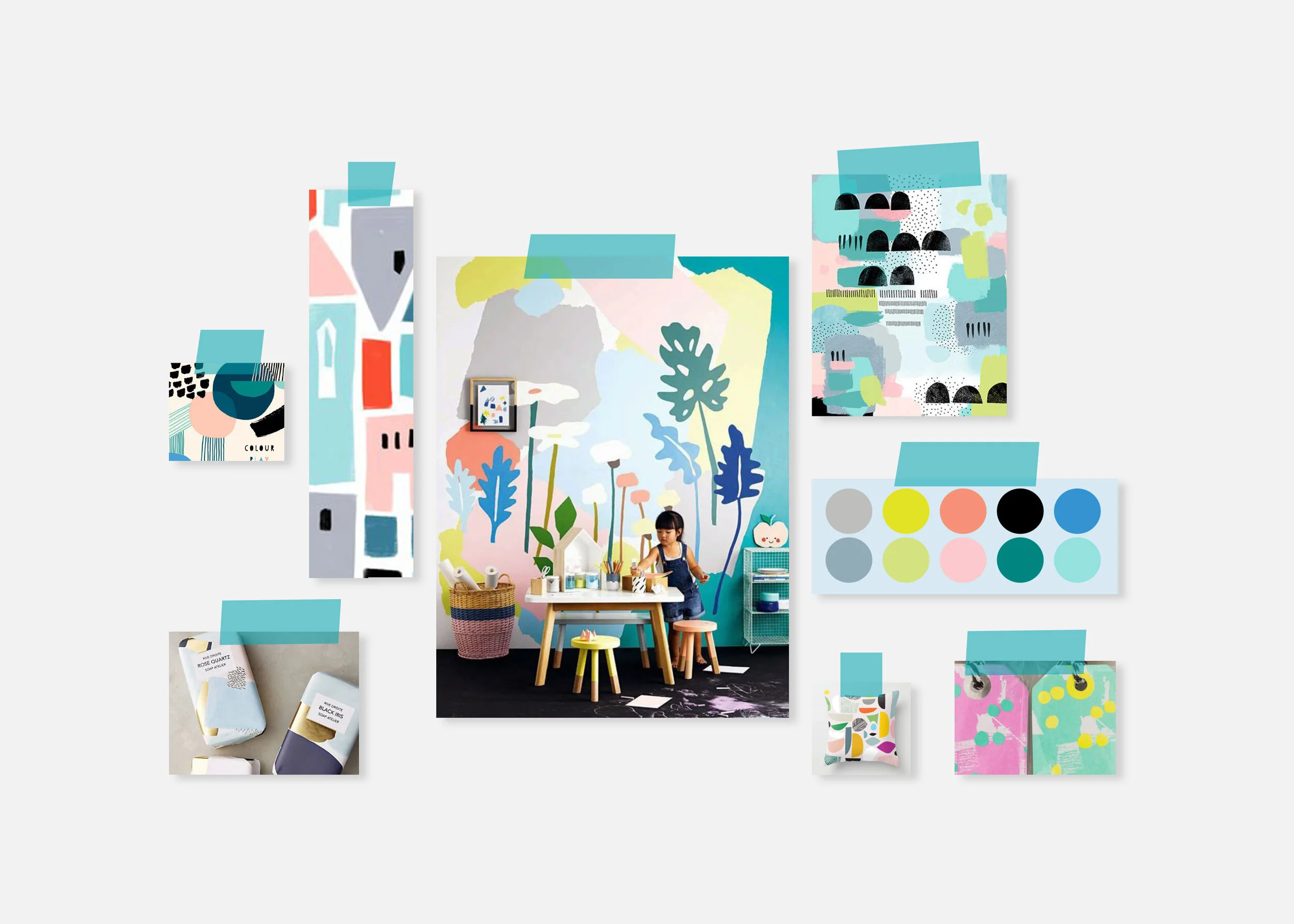
Conducted trend research before to ensure that the project aligned with current market demands and consumer preferences.
BRAND STRATEGY
Always startThe contrast of a lightweight typeface, paired with a bold, organic font provides the perfect balance of playfulness and sophistication.
PACKAGING
The perfectly imperfect–inspired by arts and crafts, this concept incorporates organic shapes, child-like illustrations, and a blend of muted pastels for a modern yet youthful approach.
CONCEPT 2
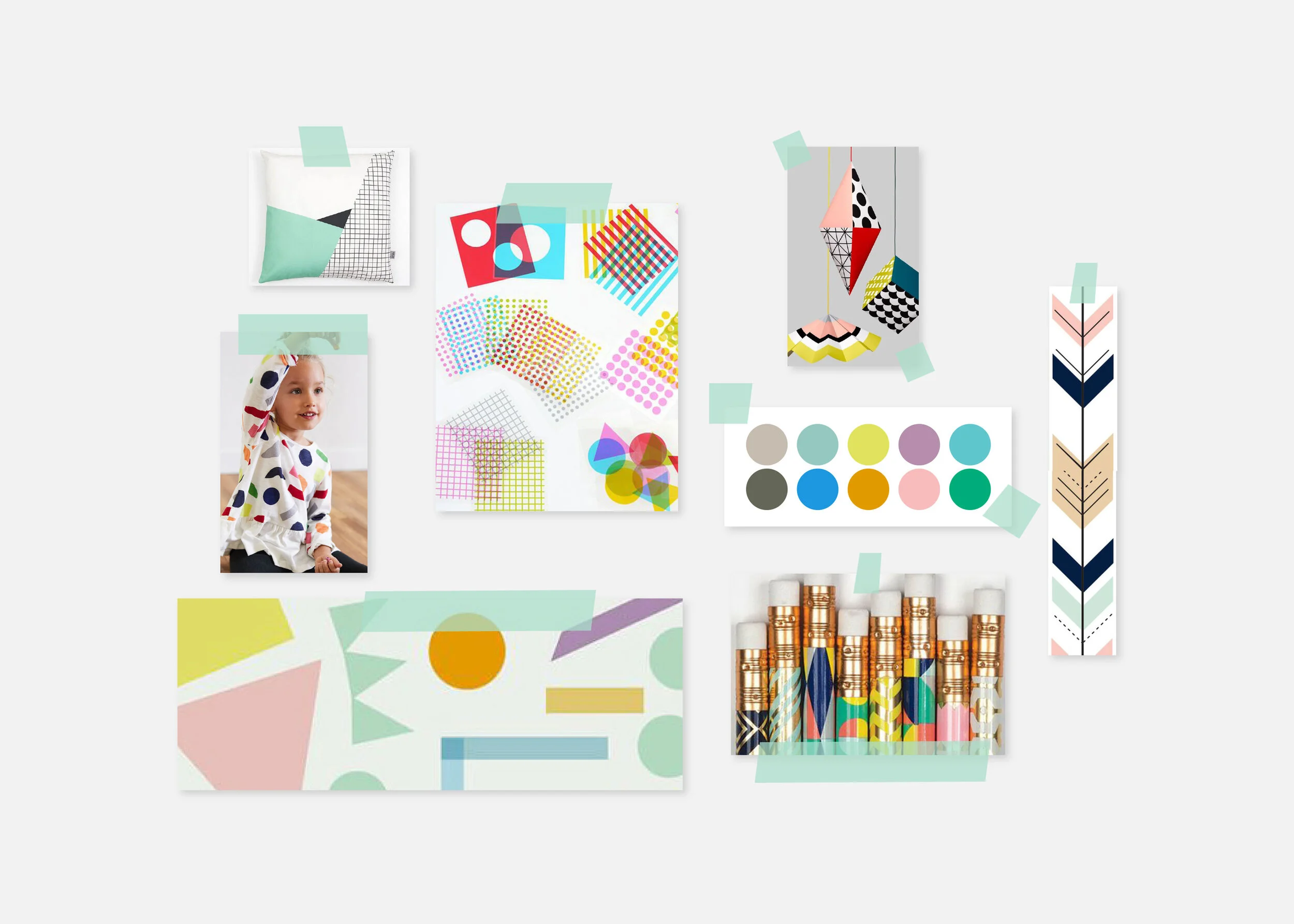
Conducted trend research before to ensure that the project aligned with current market demands and consumer preferences.
BRAND STRATEGY
This whimsical typographic treatment was created to be reminiscent of cut paper.
PACKAGING
Fun geometry–this concept implements a strategic use of vibrant, bright colors and geometric shapes in contrast with a stark white background to draw in the consumer’s eye.
CONCEPT 3
Conducted trend research before to ensure that the project aligned with current market demands and consumer preferences.
PACKAGING
Mature yet wild–this concept utilizes a darker, more sophisticated color palette with pops of color in combination with playful illustrations and strategically placed graphics to lead the consumer’s eye around the product offerings.


